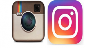
 Instagram changes its logo and the Internet goes crazy!
No matter what you think about Instagram’s logo, there are some important things we can learn from this situation and all of the hoopla associated with it.
- People feel ownership toward brands. Instagram should be happy that people have strong opinions about this. It means they care. This is a rather drastic change, and it would be far worse if they changed it and no one cared. Customers’ interaction with brands can become part of the marketing process. If you don’t believe that, do a Google search for “new Coke and the Pepsi challenge.”
- People don’t like change. We are creatures of habit and we become accustomed to certain things. A drastic change is bound to upset some people, even if it is seen as an improvement. I still remember a sorority girl pointing and laughing at my parents’ new minivan in 1984. It was probably the first minivan she’d ever seen. But I bet she drives one, now.
- Colors matter. This change is drastic for two reasons — the total look is changed, but also the colors. They might have made an intermediate step, by changing the look of the icon but using similar colors, and then later updating the colors. We know people associate brands with colors. This new color is a gradient, containing several colors (Instagram considers it a rainbow, despite the complete absence of green). Do you think the predominance of the pink reflects Instagram’s belief that their user base has a majority of females?
- A very simple combination of shapes can be very recognizable as a familiar object.
 This new logo is a true icon, where the old logo is more of an actual drawing of a camera. The new one is a circle, a rounded-corner square and a white dot, all surrounded by a larger rounded corner square. Very simple, yet we know it’s a camera. What does your camera look like? Mine is my phone. I don’t have a view-finder or a shutter switch. Yet I recognize that as a camera. Certain icons like this are very recognizable, even across cultures and generations. My son, at quite a young age, was able to identify the icon at the right as a telephone, despite never having seen a phone that looked remotely like that.
 - There are trends in design. This trend follows the “flat” design trend, which Google has tweaked and renamed Material Design. The rounded bevel look of the old logo was a popular design aspect when the logo first came out, but take a look at your phone. Most if the icons you’ll see there don’t have anything resembling a bevel.
- Designs can look dated. This can be a good thing and a bad thing. If you hold onto a logo long enough, or revert to an old version of a logo, you might be considered “Retro” or even “Vintage.” These are words that describe other current design trends.
- Logos are an important part of branding. This is the most important thing we can learn from this situation, whether you like the new logo or not. On a smartphone, a logo often doubles as the icon you tap to launch the app. It becomes the package, like a can of Coke or a Hershey bar wrapper. The logo is just part of the package, and that’s true of this Instagram update, as well. The app was redesigned, though most, if not all, of the comments centered on the logo only. Instagram has other apps, which are called Layout, Boomerang and Hyperlapse. These also got redesigned logos, and now the family of apps has a more consistent look between them than they had before. It’s important that your logo communicates what you want people to know about your company, and also that it fits with the look and feel of your website.
What do you think about the new Instagram logo? Does your company or website need a logo, or do you have a logo but need an update? Let me know in the comments below, or contact me.


